 |
 |
|
|
|
|
|
| Chapter Index |
COLORS AND MATERIALS |
First Chapter |
|
The most important purpose of color is to convey an accurate image to the viewer, whether the viewer is the Architect, the Designer, the Client, or the CADD Operator. However, we should not disregard how Construction Documents can also benefit from the intelligent use of colors. Builders love details that clearly show materials through color and are more efficient because of it.
By properly choosing colors that resemble the materials illustrated, and matching those colors to appropriate line weights, both 'readable color images' on computer screens and 'black & white' finish plots on paper can co-exist and emphasize - the very same lines - on both computer screens and paper drawings. |
|
W e b p a g e C h a p t e r s |
|
. . . . . . Introduction to the Basic AutoCad Colors Numbering System . . . . . . |
|
. . . . . . Relationship Between Screen Colors and Line Weights . . . . . . |
|
. . . . . . Material Color Associations and Application Guidelines . . . . . . |
| . . . . . . Recommended Color and Material Associations . . . . . . |
| . . . . . . Modeling Material Color and Line Weight Examples . . . . . . |
| . . . . . . Working Drawing Colors versus Rendering Model Colors . . . . . . |
Back to Intro Introduction to the Basic AutoCad Colors Numbering System
Next Chapter
Basic Colors:
001. Red
002. Yellow
003. Green
004. Cyan
005. Blue
006. Magenta
007. White
008. Dark Gray
009. Med. Gray
Gray Shades:
250. 90% Gray
251. 75% Gray
252. 60% Gray
253. 45% Gray
254. 30% Gray
255. 15% Gray
AutoCad Numbering and Color Intensity Explained
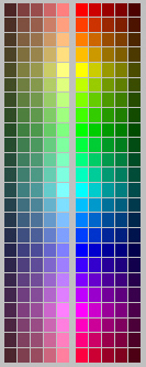
The AutoCad Color Chart below has twenty-four (24) columns, each representing the elementary range of prismatic colors, from red, to yellow, to green, to blue, to magenta, returning back to the red spectrum.
Each column of the chart is also divided into ten (10) rows, each row representing an incremental level of intensity - separated into a top half of 'full-intensity-colors' and a bottom half of 'lower-intensity-pastels'.
Full Color Palette
018 028 038 048 058 068 078 088 098 108 118 128 138 148 158 168 178 188 198 208 218 228 238 248 016 026 036 046 056 066 076 086 096 106 116 126 136 146 156 166 176 186 196 206 216 226 236 246 014 024 034 044 054 064 074 084 094 104 114 124 134 144 154 164 174 184 194 204 214 224 234 244 012 022 032 042 052 062 072 082 092 102 112 122 132 142 152 162 172 182 192 202 212 222 232 242 010 020 030 040 050 060 070 080 090 100 110 120 130 140 150 160 170 180 190 200 210 220 230 240 --- --- --- --- --- --- --- --- --- --- --- --- --- --- --- --- --- --- --- --- --- --- --- --- 011 021 031 041 051 061 071 081 091 101 111 121 131 141 151 161 171 181 191 201 211 221 231 241 013 023 033 043 053 063 073 083 093 103 113 123 133 143 153 163 173 183 193 203 213 223 233 243 015 025 035 045 055 065 075 085 095 105 115 125 135 145 155 165 175 185 195 205 215 225 235 245 017 027 037 047 057 067 077 087 097 107 117 127 137 147 157 167 177 187 197 207 217 227 237 247 019 029 039 049 059 069 079 089 099 109 119 129 139 149 159 169 179 189 199 209 219 229 239 249 Also note that the top half of numbered colors are 'even numbers' and the bottom half are 'odd numbers'. This is incredibly convenient in terms of correlating colors to line weights, as discussed in the next section.
- * -
Chapter Index Relationship Between Screen Colors and Line Weights
Next Chapter
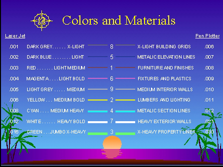
Brighter Colors on Screen = Thicker Lines on Paper . . . . Darker Colors on Screen = Thinner Lines on Paper
In the drawing above, the nine (9) 'Basic Color Lines' are assigned line weights according to screen brightness. Their AutoCad numbers are listed at the center of each line with color descriptions below. Thinner line weights and colors are toward the top - - Thicker line weights and colors toward the bottom. ( Click these text links to access the drawing in PDF or DWF format to print and view in greater detail. )
BASIC COLORS + MODEL COLORS Line thickness numbers on the left of the 'Basic Color Lines' in the chart above (i.e. The nine lines at the lower-right corner of the page.) apply, column by column, to the 'Model Colors' on the rest of the page.
Each column of colors is assigned ten numbers, with even numbers above and odd numbers below, as explained in the previous section. The first column is the 10's, second column the 20's, third the 30's, etc.
The first column on the left for example contains color '10-bright red' just above the horizontal divider line. This color is assigned 'line weight .020' which is a relatively thick line. [Bright = Thick}
If you follow the numbers in this column, you eventually end up at color '19-dark red' below the divider line. This color is assigned 'line weight .001' which is an extremely thin line. [Dark = Thin]
Colors that end in '9', such as 19, 29, 39, etc are dark colors with thickness .001 (thin) - And by design, this entire row will produce the same (thin) line weights in final plots.
Colors ending in '0', such as 20, 30, 40, etc. are bright colors with thickness .020 (thick) - So logically, this entire row will produce the same (thick) line weights in final plots.
This plot system is known as the Sunn-Starr Color and Line Weight System.
NOTES ON GRAY SCALE LINE WEIGHTS Gray Shades or 'half-tones' are used for non-solid lines with 'screening' applied in the percentages shown above. This screened plot behavior applies to actual lines and to patterns using these gray scale settings.
Half-tone settings are convenient when an entire layer or group of layers in a drawing require screening in order to plot lightly. (As in background plans for engineering drawings.)
External references or X-ref drawings to be used with screening must have all entities changed to "color by layer" so the engineer can easily change the layer to a color between 250 and 255, depending on how light or how dark the layer needs to be. This can then be accomplished in one step by changing the color on a layer or a group of layers in the Consultant's copy of the drawing, or sent ready to go by the cadd operator.
All of these plot style colors & line weights are 'tried and true' and are currently in use by countless offices. Use the button below to download plot styles for AutoCad for both color and black & white plots:
Once downloaded, you will have to copy the plot style files to the appropriate AutoCad program directory. (Usually the 'Plot Styles' subdirectory in older versions of AutoCad, or consult you local AutoCad Dealer.)
- * -
Chapter Index Material Color Associations and Application Guidelines
Next Chapter
The chart below was created from the Standard AutoCad Numbered Color System and rendered with various programs. Even though colors will vary from display to display, the basic logic below still applies.
Construction Document, 3-D Modeling and Rendering Guidelines
For Construction Documents, choose the ten color "slice" that most closely approximates materials in question, and combine thick and thin colors within that color range to simulate shadows as needed.
For 3-D Wireframe Models, choose a color to match the material closest, without concern for line thickness. This can be fixed after converting 3-D models to 2-D elevations through layer/color settings.
For Renderings, apply materials to models only when absolutely necessary. With most rendering software, the default colors may render well enough for schematic/preliminary design presentations.
Finally, for Photo-Realistic Interiors and Renderings, none of these short-cut rules apply. Lighting is everything and all materials applied to the model affect the final result. Sky is the limit on realism.
- * -
Chapter Index Recommended Color and Material Associations
Next Chapter
The color numbers used below are based on the Standard AutoCad Color System and the materials list is only a starting point.
Colors
Samples
Materials
019, 017, 015, 013, 011 ~ 010, 012, 014, 016, 018

Red Brick, Dark Spanish Tile, Cherry Woods
029, 027, 025, 023, 021 ~ 020, 022, 024, 026, 028 . 039, 037, 035, 033, 031 ~ 030, 032, 034, 036, 038 Orange Finishes, Light Spanish Tile, Woods 049, 047, 045, 043, 041 ~ 040, 042, 044, 046, 048 . 059, 057, 055, 053, 051 ~ 050, 052, 054, 056, 058 Yellow, Gold & Brass Fixtures, Raw Lumber 069, 067, 065, 063, 061 ~ 060, 062, 064, 066, 068 . 079, 077, 075, 073, 071 ~ 070, 072, 074, 076, 078 Bright Green Perimeter Lines and Main Trees 089, 087, 085, 083, 081 ~ 080, 082, 084, 086, 088 . 099, 097, 095, 093, 091 ~ 090, 092, 094, 096, 098 Green Ground Cover in Parking Area Islands 109, 107, 105, 103, 101 ~ 100, 102, 104, 106, 108 . 119, 117, 115, 113, 111 ~ 110, 112, 114, 116, 118 Dark Green for Low-height Perimeter Shrubs 129, 127, 125, 123, 121 ~ 120, 122, 124, 126, 128 . 139, 137, 135, 133, 131 ~ 130, 132, 134, 136, 138 Sky Finishes, Glass, Metals in Section View 149, 147, 145, 143, 141 ~ 140, 142, 144, 146, 148 . 159, 157, 155, 153, 151 ~ 150, 152, 154, 156, 158 Powder Blue Finishes, Storefront Mullions 169, 167, 165, 163, 161 ~ 160, 162, 164, 166, 168 . 179, 177, 175, 173, 171 ~ 170, 172, 174, 176, 178 Blue Finishes and Metals in Elevation View 189, 187, 185, 183, 181 ~ 180, 182, 184, 186, 188 . 199, 197, 195, 193, 191 ~ 190, 192, 194, 196, 198 Violet Finishes, Canopies, Exterior Fabrics 209, 207, 205, 203, 201 ~ 200, 202, 204, 206, 208 . 219, 217, 215, 213, 211 ~ 210, 212, 214, 216, 218 Magenta Finishes, Appliances and Fixtures 229, 227, 225, 223, 221 ~ 220, 222, 224, 226, 228 . 239, 237, 235, 233, 231 ~ 230, 232, 234, 236, 238 Pink Finishes, Plastics, Roofing Membranes 249, 247, 245, 243, 241 ~ 240, 242, 244, 246, 248
.
Along with the colors listed above, heavy use can be made of Gray Shades in representing ground planes, raw concrete, non-decorative or unfinished drywall, etc. It is usually best to limit the use of Basic Colors to 2D Working Drawings and Details only. The full 256 color palette should be used for 3D Model Drawings.
These standard colors are also an ideal way to convert line weights and colors used in drawings produced by outside Consultants. And this color and line weight system is in no way limited to just AutoCad.
In interiors work for instance, the color logic might be to assign 'cool colors' to items close to the ground (i.e. chairs, file pedestals, etc.), assign neutral colors, gray shades and whites to mid-height items (i.e. counters, work surfaces, etc.), and to assign 'warm colors' to items close to the ceiling (i.e. overhead binder-bins, partition panels, etc.) - keeping in mind the logical association that heat rises toward ceilings.
Staying flexible and using similar color logic for 2D and 3D work is desirable, but not mandatory. Conveying material awareness and being smart about finished line weights is the name of the game.
Color and line weight logic is a short-cut, not a burden. Eventually all of this does become second nature and fun. Efficiency, quality and productivity are merely the side effects of using this system. Remember: Cadd illiterate users may never understand, so your final drawings and images will have to speak for themselves. Not to be over-simplistic or over-complex, but high quality work will never go out of style.
- * -
Chapter Index Modeling Material Color and Line Weight Examples
Next Chapter
In the schematic design images to follow, minimum materials were applied to the model and the model's emphasis became the roofing tile. To present these images in a design development presentation, an 'interrupted-pass' rendering technique could be used. (After adding trees and shrubs in the foreground.)
A relatively obscure paint program by the name of Piranesi that applies watercolor and paint style filters to 3D images such as the ones here is another great presentation solution. Sometimes allowing room for client design feedback and changes to their project is more important than obsessing over rendering styles.
Providing black & white wireframe backgrounds to an artist for manual rendering is another effective way to take advantage of 3D modeling as a tool in the design stages of a project. Each presentation technique has its advantages and all should be used to refine unique and individualized designs whenever possible.
These early 3D stage images were created using Accurender. ( Trees, people and cars are not always used in the early design development phases.) Transparent trees and shrubs can add interest without interfering with buildings. Cars and people, on the other hand, can often be a distraction to the design.
Samples of 3-D Models Using Colors and Line Weights Before Materials Are Applied
Images courtesy of: Faulconer & Carawan Architects - Ventura, California
- * -
Chapter Index Working Drawing Colors versus Rendering Model Colors
Back to Intro
Expressing materials on the computer screen
and
Printing readable line weights on paper
In the construction document images below, the colors used served an important dual purpose: First, they represented a hint of the actual materials that were specified for this building. Second, and perhaps more importantly, the colors actually control the line weights that appear on the final printed drawings. That includes building sections, wall sections, construction details, etc. (View larger versions for more detail.)
Images courtesy of T. W. Layman Associates - Encino, California
Image above was first converted to AutoCad-2000 format, then to Express Viewer DWF format, then to Adobe Reader PDF format, and finally to JPEG Format.
Rendering Colors and Display Resolution The shopping center images above have been presented in three (3) different formats (jpg, dwf, and pdf) to illustrate the final line weights obtainable on paper. Downloading the viewers is well worth the effort.
Of course, since visitors to this website will likely be using several different display technologies to view these images (i.e. standard crt, flat panel lcd, projector, hdtv, etc.), the quality of the lines on the screen may not be as easy to appreciate as seeing the actual images printed on paper.
In any case, we hope that the few images provided have been adequate enough to convey the sophistication of the dual-purpose 'Sunn-Starr Color and Line Weight System' - How it has evolved, and how it is being used in the real world. Below is one last image using this system for comparison:
Models and visuals by Sunn-Starr Architectural, Inc. Images courtesy of: L. C. G. - Porter Ranch, California As always, thank you for reviewing this portion of our web site. We hope the information is useful and that you contact us with any comments and suggestions you may have on how we can improve the system.
- o O o -
For internal service requests please forward your e-mail to cadd director at the link below :
Copyright © Sunn-Starr Architectural, Inc. Lookinglass Systems Division ® 1984